Caitlin Gilbert

Data Reporter @ The Washington Post. For my neuroscience PhD work on songbird brains, I developed skillsets in data mining, statistical modeling, machine learning, and visualization.
Expertise: the brain / linguistics / elections / disinformation / genomics
Washington Post author page | Financial Times author page | LinkedIn | Github
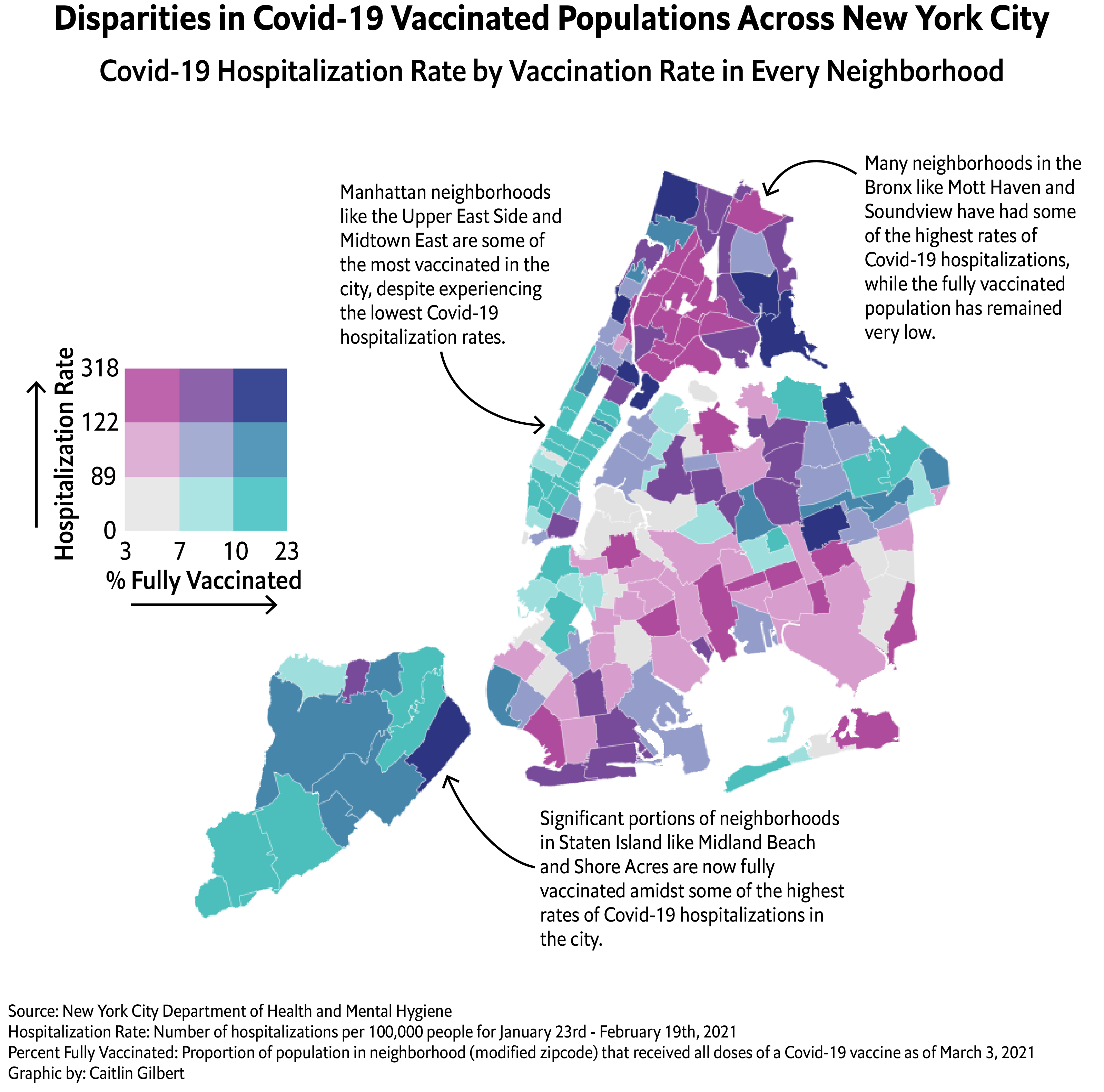
Bivariate Choropleth Map of Covid-19 Vaccination and Hospitalization Rates Across NYC Neighborhoods
Visualization Details: Vaccination and hospitalization data as well as modified ZCTA shapefiles are sourced from the New York City Department of Health and Mental Hygiene. Hospitalization rates are calculated as cumulative hospitalizations in the 28-day window per 100,000 people. Percent fully vaccinated numbers are based on population estimates for each neighborhood. Bivariate data scaling was done using the R biscale package with ‘fisher’ binning to best represent the distributions of fully-vaccinated percentages and hospitalization rates. Choropleth map uses modified zipcode tabulation areas drawn by the NYC DoH. Plot was made using R/Illustrator.